When selecting the perfect finish for your printing projects, deciding between gloss vs. matte laminate is crucial. Each finish offers unique benefits and aesthetic appeals, making them suitable for various applications. This article provides a detailed comparison to help you make an informed decision tailored to your packaging needs.
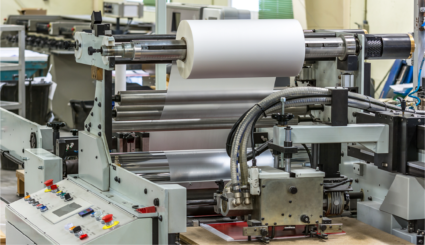
Understanding Gloss Laminates
Gloss laminates are renowned for their vibrant and shiny finish. This type of laminate is ideal for enhancing the color depth and vibrancy of printed materials. The reflective surface adds a dynamic visual appeal and draws attention, making it a popular choice for marketing materials such as brochures, photos, and covers.
Benefits of Gloss Laminate:
Enhanced Color and Brightness: Gloss laminate amplifies the colors of the underlying print, making images appear more vivid and striking. This can be particularly beneficial for graphical prints where high impact is desired.
Durability and Protection: The shiny surface of gloss laminate is less prone to scratching and dirt, providing excellent protection for frequently handled items.
Professional Appearance: Glossy finishes are often associated with a more professional and polished look. This is essential for business presentations or promotional materials.
Exploring Matte Laminates
Matte laminate offers a subtle, elegant finish perfect for those seeking a more understated look. Unlike its glossy counterpart, matte laminate reduces glare and reflection, which makes it an ideal choice for products that require frequent viewing under varied lighting conditions.
Benefits of Matte Laminate:
Reduced Glare: The non-reflective surface ensures that documents and materials are easier to read, even under intense light.
Fingerprint Resistance: Matte finishes are better at hiding fingerprints and smudges, maintaining a clean and professional appearance over time.
Sophisticated Visual Appeal: The soft and smooth texture of matte laminate adds a layer of sophistication, enhancing the overall aesthetic of printed materials.
Incorporating Laminate Choices into Design
Understanding the impact of each laminate type on the final product is essential for designers. It’s important to consider each finish’s aesthetic aspects and practical implications. For instance, while gloss might enhance the colors of a design, it could also introduce issues with glare under certain lighting conditions. Similarly, while matte might enhance readability, it may also mute certain colors and details.
Optimizing Your Print Materials for Desired Outcomes
To maximize the effectiveness of your printed materials, consider the following tips:
Test Different Laminates: Before finalizing your print order, test both gloss and matte finishes to see which brings out the best in your design.
Consult with Professionals: Graphic designers and printing experts can provide valuable insights into which laminate would best suit your project’s needs.
Consider Your Audience/Brand: Consider the preferences and expectations of your audience. What finish would they find most appealing or appropriate?
Conclusion
Choosing between gloss vs. matte laminate involves more than just aesthetic preference; it requires thoughtful consideration of how each finish will enhance the functionality and appeal of your printed materials. Whether you aim for durability and vibrancy with gloss or sophistication and readability with matte, the right choice will elevate your project and ensure it makes the lasting impression you desire.
Choosing the right materials for your custom cannabis label solutions can feel overwhelming. Notably, if you’re unfamiliar with all the options available.
The first thing you need to ask yourself is, “How will these labels be used?” Secondly, consider “What type of look am I going for?”
Once you’ve answered these questions, you’ll have a solid foundation for selecting the right functional and aesthetic materials. But let’s break it down further by exploring some of the most common options for label solutions and how they fit into 420 packaging.
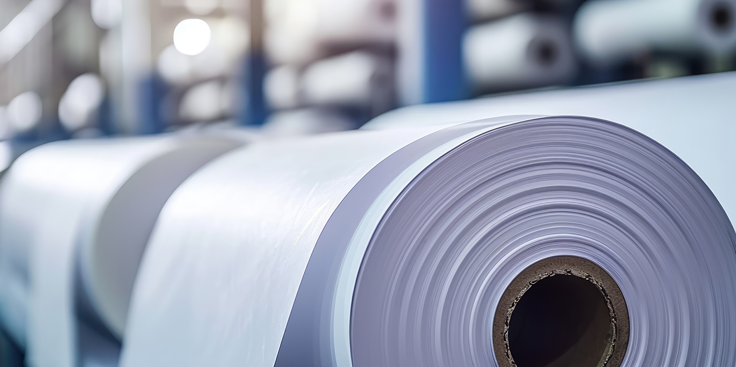
1.) BOPP (Biaxially Oriented Polypropylene)
BOPP is a popular choice in custom dispensary packaging because of its strengths and adaptability.
Advantages
Durability – Resistant to water, oil, and chemicals—perfect for weed packaging labels.
Clarity – High transparency and glossy finish create a premium appearance.
Flexibility – Ideal for food, beverages, health, beauty, and custom packaging labels.
Printability – Allows for crisp, high-quality graphics that make your weed label stand out.
Disadvantages
Cost – More expensive than standard paper labels.
Environmental Impact – A plastic-based material, it’s not the most eco-friendly option.
2.) Vinyl
Vinyl labels are an excellent choice when durability is a priority. If your product needs to withstand tough conditions, vinyl might be your best bet.
Advantages
Extreme Durability – Resistant to water, UV rays, and abrasion.
Flexible Application – Works well on curved or irregular surfaces.
Strong Adhesion – Stays put on even the trickiest of packages.
Disadvantages
Cost – Typically pricier than BOPP and paper labels.
Not Biodegradable – Like BOPP, vinyl isn’t the most eco-friendly option.
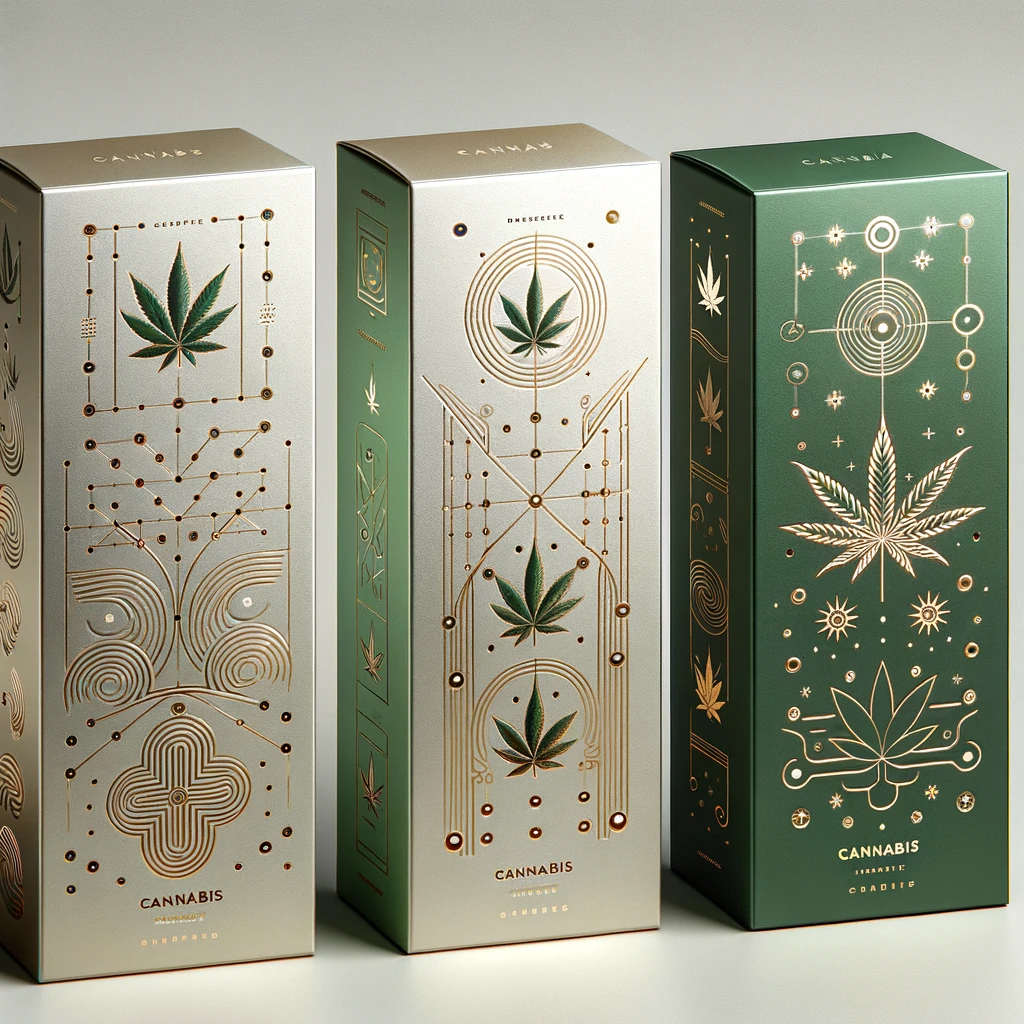
3.) Foil
Want to make your packaging shine? Foil labels bring an eye-catching, premium look to your custom cannabis label solutions.
Advantages
Luxury Appeal – Metallic sheen adds a high-end, attention-grabbing finish.
Resilient – Resistant to moisture, oils, and some chemicals.
Barrier Properties – Helps protect contents from light and oxygen exposure.
Disadvantages
Higher Cost – More expensive due to material and processing.
Limited Flexibility – May not conform to all packaging surfaces.
4.) Paper
Paper labels are the most economical choice and are great for brands looking for an eco-friendly and cost-effective custom dispensary packaging solution.
Advantages
Budget-Friendly – The most affordable label option.
Excellent Printability – Provides a clean, high-quality print surface.
Eco-Conscious – Biodegradable and recyclable—ideal for sustainable brands.
Disadvantages
Less Durable – Not resistant to water, oil, or tearing.
Limited Applications – Not suitable for outdoor or high-moisture environments.
Which Label Material is Right for You?
Choosing the perfect label material depends on your specific needs. Whether you’re focused on durability, aesthetics, cost, or sustainability, there’s a solution that fits.
If you need expert guidance on selecting the best weed packaging labels for your brand, we’re here to help. We specialize in custom cannabis label solutions and offer a variety of custom packaging labels to suit any product. Contact us today to explore the best labeling options for your business!
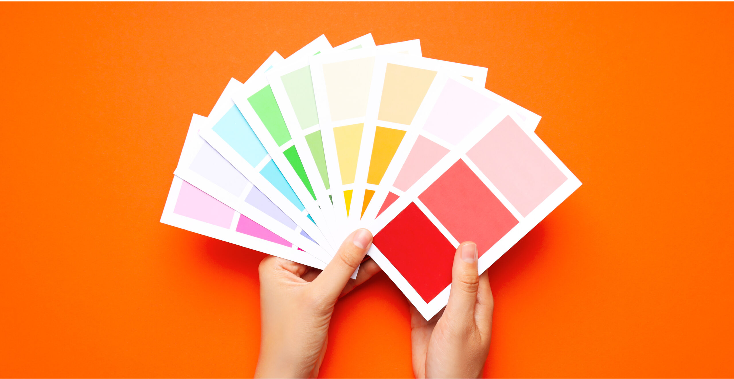
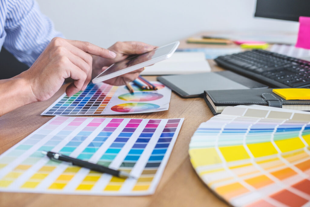
A cannabis color palette isn’t just about aesthetics; it’s a key part of brand identity. In today’s competitive cannabis market, color does more than make packaging look good; it shapes how customers feel about a product before they even pick it up. Each shade carries emotional weight, influencing everything from perceived quality to purchase intent.
Research shows that up to 90% of first impressions are based on color alone, proving that choosing the right cannabis brand design colors can determine whether your brand stands out or gets lost on the shelf.
Key Highlights
The Power of Color – A well-chosen cannabis color palette influences consumer perception, evokes emotion, and drives purchase decisions, making it a critical element of brand strategy.
Strategic Application – Effective palettes align with brand personality, product type, and audience expectations, while maintaining legibility, consistency, and accessibility across all packaging and marketing channels.
Trends and Psychology – Modern cannabis brands leverage color psychology and design trends (like bold minimalism, tactile effects, and eco tones) to stand out, build trust, and create memorable brand experiences.
Why Color Matters in Cannabis Packaging
Color isn’t just visual; it’s psychological. In cannabis packaging, it plays a direct role in shaping consumer behavior. Studies show that most purchase decisions happen in seconds, often driven by emotional cues rather than logic. That means your cannabis branding color palette can be the deciding factor between a sale and a pass.
Here’s how the right palette can influence your brand’s success:
Capture attention. Vibrant, balanced colors help your products stand out on crowded dispensary shelves.
Communicate meaning. Different hues signal product type, quality, and even effects (like soothing greens for relaxation or energetic yellows for creativity).
Build loyalty. Consistent use of color across your packaging, website, and marketing creates familiarity and trust over time.
Boost recognition. A cohesive cannabis color palette can increase brand recall and trust by as much as 80%.
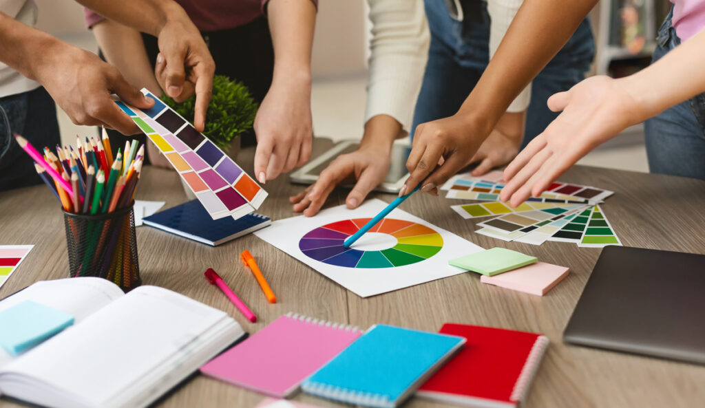
How to Build Your Cannabis Color Palette
Building an effective cannabis color palette starts with clarity: knowing your brand personality, understanding your audience, and defining the emotional response you want to create. Successful cannabis brands approach color strategically, using it as a visual language that connects product experience with consumer perception.
Here’s a practical framework to guide your process:
1. Define Your Brand Personality
Ask what your brand represents (luxury, wellness, creativity, calm, or energy). Each trait aligns with specific color choices. Keeping this consistent across packaging, marketing, and online channels reinforces your identity and strengthens brand recognition.
2. Connect Product Attributes to Color
Different cannabis products and strains naturally align with unique color families that reflect their effects and mood:
Indica – Deep purples and cool blues evoke calm and relaxation.
Sativa – Bright yellows, greens, and oranges express creativity and energy.
Hybrid – Soft greens, muted purples, and neutrals represent balance and harmony.
CBD Products – Clean whites, light greens, and blues signal purity and wellness.
3. Choose Primary, Secondary, and Accent Colors
Your primary color should communicate your brand’s core identity, while secondary and accent colors create depth and distinction between products or strains. This hierarchy keeps your design cohesive and visually engaging.
4. Test and Refine
Colors behave differently across packaging materials, digital screens, and lighting. Use mockups to test shelf appeal and online presentation. Refine until your palette delivers consistent impact everywhere your brand appears.
Color Psychology for Cannabis Brands
Color psychology plays a major role in shaping how consumers interpret the best color palette for cannabis brands.
Every hue carries emotional meaning and influences how your brand is perceived, from calming and trustworthy to bold and adventurous. Understanding these associations helps you choose colors that support your product’s purpose and connect authentically with your audience.
Below is a breakdown of how specific colors impact cannabis branding today:
Green: The Freshness of Nature
Symbolism – Growth, wellness, balance, and sustainability.
Use Case – Best for eco-conscious or natural cannabis brands that emphasize organic cultivation or holistic wellness.
Caution – Since green dominates the cannabis industry, rely on secondary tones or textures to keep your packaging distinctive.
Red: The Power of Excitement
Symbolism – Energy, confidence, and stimulation.
Use Case – Effective for bold, high-potency strains or products that evoke passion and intensity.
Caution – Use sparingly. Too much red can feel aggressive or signal danger.
Blue: The Psychology of Calm
Symbolism – Trust, reliability, and tranquility.
Use Case – Ideal for premium, medical, or wellness-focused cannabis lines that aim to inspire calm.
Caution – Overuse can create a cold or distant tone.
Yellow: The Brightness of Optimism
Symbolism – Creativity, happiness, and warmth.
Use Case – Perfect for sativa-dominant or mood-boosting products.
Caution – Excessive yellow may cause visual strain or anxiety.
Orange: The Vibrancy of Youth
Symbolism – Enthusiasm, confidence, and playfulness.
Use Case – Appeals to younger audiences and lifestyle-driven brands.
Caution – Less suitable for luxury or medical-focused products.
Purple: The Richness of Sophistication
Symbolism – Royalty, mystery, and relaxation.
Use Case – Works well for indica strains or upscale cannabis brands.
Caution – Deep purples can feel heavy without balancing lighter accent colors.
Pink: The Playfulness of Expression
Symbolism – Creativity, approachability, and warmth.
Use Case – Common in feminine or lifestyle-focused cannabis branding.
Caution – Can appear gendered. Ensure to balance with neutral or natural tones.
Black: The Elegance of Minimalism
Symbolism – Power, exclusivity, and sophistication.
Use Case – Perfect for minimalist or premium cannabis products.
Caution – May appear harsh without metallic or bright accents for contrast.
White: The Purity of Simplicity
Symbolism – Cleanliness, clarity, and quality.
Use Case – Ideal for CBD and wellness brands that emphasize purity and transparency.
Caution – Can feel sterile if not paired with soft neutrals or natural textures.
Sample Cannabis Color Palettes (with HEX Examples)
Below are a few ready-to-use cannabis color palettes that illustrate how tone can align with product purpose.
Relax (Indica) Palette
Deep Plum – #4B244A
Midnight Blue – #2B3A67
Sage Green – #A3B18A
Energy (Sativa) Palette
Bright Lime – #C1FF72
Warm Yellow – #FFD60A
Burnt Orange – #FF6F00
Wellness (CBD) Palette
Soft Blue – #B5D3E7
Cream – #F5F3E7
Olive Green – #7C9473
Luxury (Premium Brand) Palette
Jet Black – #0B0C10
Gold Accent – #D4AF37
Ivory – #FAF6F0
Trends in Cannabis Color Design
Modern cannabis packaging color trends reflect a shift toward sophistication and sensory appeal.
Today’s leading brands are moving away from clichéd “green leaf” visuals and experimenting with textures, contrast, and emotion-driven color combinations. The goal isn’t just to look appealing; it’s to communicate values like sustainability, creativity, and premium quality through design.
Here are some of the most effective color trends shaping the cannabis industry:
Matte black with metallic accents – Creates a sleek, high-end look that appeals to luxury consumers.
Retro typography with pastel hues – Combines nostalgia with approachability, perfect for lifestyle or wellness brands.
Eco-inspired tones – Earthy greens, natural neutrals, and recycled textures signal environmental responsibility.
Fluorescent pops on dark bases – Bright accents highlight product details and attract attention on both shelves and screens.
These design approaches balance visual impact with brand storytelling, helping products stand out in dispensaries and digital marketplaces alike.
Practical Tips for Color Application
Choosing your cannabis color palette is only half the job: how you apply it determines how effective your branding will be. Thoughtful color use improves readability, builds trust, and ensures your design works across every touchpoint, from packaging to digital ads.
Here are a few practical tips to get it right:
Prioritize contrast and legibility. Make sure strain names, dosage details, and legal information remain clear against background colors. High-contrast designs enhance both readability and compliance.
Maintain visual consistency. Use the same hues and tones across product lines to create instant brand recognition and cohesive storytelling.
Check accessibility. Test your color palette with color-blindness simulators or online accessibility tools to ensure all customers can engage with your design.
Match color to brand emotion. Every shade should align with your brand’s story, target audience, and desired emotional impact, whether it’s calm, creativity, or luxury.
Final Word
A thoughtful cannabis color palette does more than make your packaging look appealing; it creates emotional resonance. When color choices align with your brand story and audience values, they become powerful tools for connection and recognition.
By understanding color psychology and applying it with intention, cannabis brands can craft designs that stand out, build trust, and inspire loyalty. From calming greens to bold metallics, every hue has the potential to influence how consumers feel and what they choose.
Color isn’t just visual; it’s strategic. When used effectively, it strengthens identity, drives sales, and helps your brand leave a lasting impression in an increasingly competitive market.
Looking to create a cannabis color palette that truly connects with your audience? Custom 420 Supply can help. Our team of in-house designers works directly with brands to craft color strategies that elevate packaging, convey your story, and make your products unforgettable. We invite you to reach out through our contact page today!
Frequently Asked Questions (FAQs)
What color palettes work best for cannabis brand identity?
Effective palettes align with your brand personality and product type. Greens, purples, and blues communicate wellness or relaxation, while oranges and yellows convey energy and creativity. Luxury lines often use black, gold, and cream for sophistication.
How do color psychology and cannabis branding intersect?
Color psychology influences consumer perception, emotion, and purchasing decisions. By choosing colors that reflect your brand’s story and product effects, a cannabis color palette can trigger trust, excitement, or calm, directly impacting conversions and loyalty.
What are emerging color palette trends in cannabis product packaging?
Current trends include bold minimalism, retro-inspired pastels, eco-friendly earthy tones, and metallic accents. Fluorescent highlights and tactile finishes are also popular, helping products stand out on shelves and in digital marketplaces.
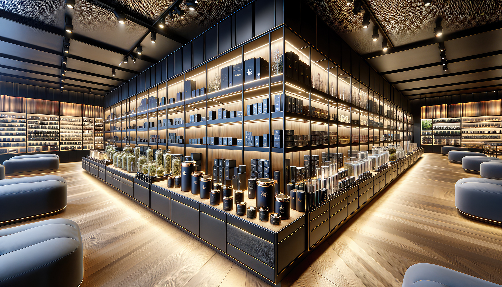
In today’s market, product packaging is not just a means of protection. It’s a significant aspect of marketing strategy that influences consumer perception and purchase decisions. Correlating packaging with price is an art that requires understanding the nuances of consumer behavior, material costs, and the psychological impact of design elements. Let’s dive deep into how businesses can master product price points to enhance their brand value and market positioning.
Understanding the Essence of Packaging
The Role of Packaging in Marketing
Packaging serves multiple purposes: it protects the product, provides essential information, and most importantly, it communicates the brand’s message. It’s the first thing a consumer interacts with, making it a critical touchpoint in the marketing funnel. The consumer’s first impression could make or break a sale.
Perceived Value and Packaging
The design, quality, and innovation of a package can significantly affect the perceived value of a product. A well-designed package can command a higher price, as it suggests superior quality and enhances the unboxing experience. But selling a high-end product in cheap packaging could be a death sentence.
Correlating Packaging with Price
Material Matters
Selecting the right packaging material is crucial. Sustainable, high-quality materials may cost more but can justify a higher price point and attract eco-conscious consumers. Add foils and special finishes to help the packaging stand out and utilize materials effectively.
Design and Complexity
The complexity of the design also plays a role. Intricate designs with unique opening mechanisms or personalized touches can make the product stand out on the shelves, allowing for a premium pricing strategy. Unique designs are sure to catch a potential customer’s eye.
Brand Consistency
Ensuring the packaging aligns with the brand’s overall image and values is essential. Consistency across products reinforces brand recognition and loyalty, supporting a higher price range. This also helps with brand recognition and repeat sales.
Cost-Effective Packaging Strategies
Balancing Quality with Cost
While aiming for high-quality packaging, you need to balance costs to avoid pricing your product out of the market. Economies of scale and smart design choices can help maintain this balance. When selling a high-end product, your packaging should follow suit. The goal is to create an experience for the user from the initial opening until the product is finished.
Leveraging Technology
Advancements in packaging technology, such as digital printing and utilizing mixed print runs, can reduce costs and allow for small-batch customization without a significant price hike.
Sustainability as a Value Proposition
Sustainable packaging is ethical and a selling point that can justify a higher price. Consumers are willing to pay more for products that align with their values, especially if you position your brand messaging this way.
Case Studies: Success Stories of Effective Packaging
Analyzing successful brands can provide valuable insights into effective packaging strategies. From luxury brands that use packaging to enhance exclusivity to eco-friendly brands that use minimal, sustainable packaging to appeal to their target audience, there is much to learn from the market leaders. Think beyond the cannabis packaging realm and look at high-end cosmetics and food items. Products with high price points in their respective category often have packaging that correlates with product cost.
Future Trends in Packaging
Innovations to Watch
The future of packaging lies in smart, interactive packaging that enhances user experience and sustainability efforts that reduce environmental impact. Incorporating QR codes and augmented reality can help create a deeper experience.
Customization and Personalization
As technology advances, personalized packaging will become more accessible, allowing brands to offer unique experiences without a hefty price tag. Tailoring items focused on local trends and preferences could help lead to greater sales.
Conclusion
Mastering the correlation between packaging and price is essential for cannabis businesses aiming to position their products effectively in the market. By focusing on material quality, design innovation, and brand consistency, your business can create packaging that justifies the price and appeals to its target audience. Remember, packaging is not just a container; it’s a critical marketing tool that communicates your brand’s value proposition.
As we progress through the 2020s, design trends are changing. We see a surge in classical elements matched with specific Pantone color schemes. Throughout this article, we’ll seek the five best cannabis design trends for your brand.
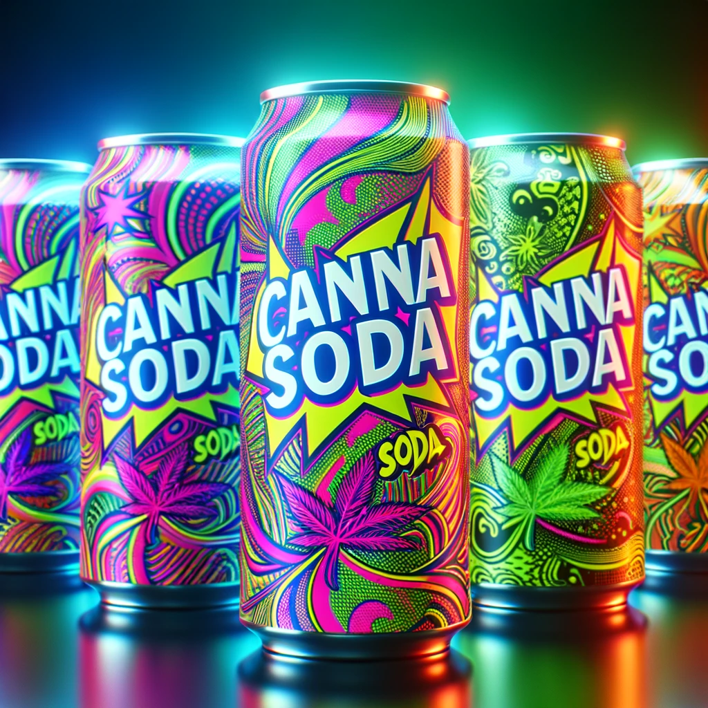
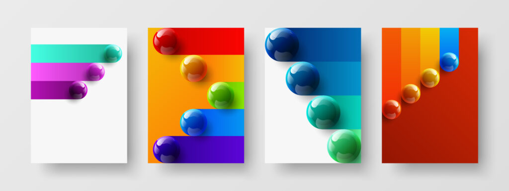
The Surge of Fluorescent Colors
In the vibrant world of graphic design for 2024, a thrilling trend is the adoption of luminous and vivid color schemes. Designers across the spectrum (from digital interfaces to print and branding) apply palettes that captivate and make a bold statement. Electric yellows, bold blues, vivid oranges, and lively greens are at the forefront. They transform mundane visuals into fresh and modern masterpieces.
This resurgence of fluorescent colors is not just about being seen; it’s about being remembered, allowing designs to communicate vibrant visual tales that resonate deeply. Hit movies like Barbie and popular sportswear trends from the top brands continue to keep these color schemes relevant.
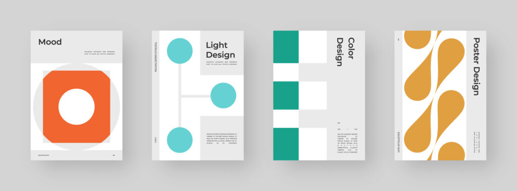
The Essence of Minimalist Design
Amidst the color explosion, minimalism maintains its timeless allure, proving its enduring relevance in 2024’s design ethos. With its core philosophy of ‘less is more,’ minimalism elevates simplicity to an art form.
It focuses on essential elements and embraces clean lines and generous white spaces, minimalist designs achieve a serene elegance. This restrained approach enhances message clarity, leveraging a limited color palette and refined typography to deliver pinpoint messages. In a world of visual noise, minimalism’s whisper often carries the most weight.
While this might seem like a contrast to loud florescent colors, these trends could flow together for a modern take on design trends. This could be a nice play on bold minimalism which embellishes the focal elements. Therefore, it can further enhance the contrast against a minimal background on cannabis packaging designs.
The 3D Design Evolution
3D design has witnessed a significant renaissance in 2024, becoming more accessible than ever. Innovations like Adobe Illustrator’s “Inflate” feature simplify 3D design and invite a broader spectrum of creators to explore this dimension.
Gone are the days when 3D design was the exclusive domain of specialized designers. Today, the integration of 3D elements ranges from subtle enhancements in layouts to intricate masterpieces. This signals an era where 3D’s potential has only begun to be tapped into.
3D Render tools (i.e. Blender) allow for simplified interactive 3D content. To take 3D design and animation to the next level, designers have adopted web design elements.
Nostalgia and Retro Revival
As the digital age accelerates, there is a desire for retro and vintage designs. This trend taps into the power of nostalgia and offers an escape into the ‘good old days’ of design. The resurgence of grainy visuals, cartoon characters, and a palette reminiscent of yesteryears not only delights the senses but also reconnects us with the heartfelt creativity of the past.
Vintage minimalism, a fusion of classic and contemporary, has gained momentum, marrying the simplicity of minimalism with the charm of retro aesthetics. Many famous brands have relaunched retro designs for retail products and advertising campaigns. Therefore, it’s easy to see why this trend has been adopted for cannabis brand identity.
The Craft of Upscale Printing
In an increasingly digital landscape, the allure of end-to-end print experiences is stronger than ever. 2024 sees a revival in sophisticated printing techniques, from the time-honored crafts of embossing/foiling to the innovative use of materials (i.e. post-consumer paper stocks and kraft paper).
These methods infuse print designs with unparalleled depth and texture, offering a tangible counterpoint to the ephemeral nature of digital media. As we move through 2024, the interplay of advanced technology and traditional craftsmanship redefines the boundaries of graphic design. It creates memorable experiences that engage both sight and touch.
In summary, 2024’s cannabis design trends are a dynamic blend of the past and future, where the vibrancy of fluorescent colors, the clarity of minimalism, the innovation of 3D design, the nostalgia of retro influences, and the tactile richness of upscale printing converge to redefine visual communication.