The Critical Impact of Color Choices on Product Packaging
The selection of the right color in product packaging is not just an aesthetic choice; it directly influences consumer perception and, by extension, the product’s success. Different colors evoke different emotions and associations, making color choice a crucial part of the branding strategy. For instance, blue can convey trust and dependability, while red might ignite feelings of excitement and urgency. So, how should you choose your cannabis packaging colors?
Consumer Psychology: Triggering Purchase Decisions
Colors in packaging do more than attract attention. They play a pivotal role in decision-making. With most purchase decisions made impulsively at the point of sale, the right color can differentiate between a product being noticed or overlooked. Effective use of color can trigger an emotional response, encouraging consumers to act and thus increasing conversion rates.
“Up to 90% of an initial impression comes from color.” (Hubspot blog)
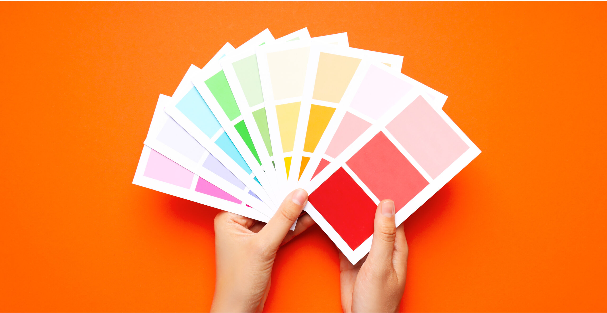
Market Differentiation: Standing Out in a Crowded Marketplace
In a highly competitive market, products need to differentiate themselves. Color is a powerful tool to achieve this differentiation. Choosing unique color combinations can set a product apart from competitors, making it more recognizable and memorable to consumers.
Brand Loyalty: Fostering Emotional Connections
Color consistency across product lines reinforces brand recognition, fostering a sense of familiarity and trust among consumers. This consistency helps build a loyal customer base, as consumers gravitate towards brands they recognize and feel connected to.
“Color can increase brand awareness and recognition by 80%”
The Emotional Response: How Our Brains React to Specific Colors
The Freshness of Green
- Symbol of Nature: How John Deere uses green to connect the brand to nature.
- Psychological Effects: The calming versus stagnant implications of green.
- Market Positioning: Green’s role in environmental and health-focused branding.
The Intensity of Red
- Power and Passion: Companies like Coca-Cola use red to stimulate excitement.
- Behavioral Influence: How red can drive action and signify danger.
- Cultural Significance: The varied interpretations of red across different contexts.
The Psychology of Blue
- Blue in Branding: How companies like Ford Motor Company use blue to evoke trust and reliability.
- Consumer Perception: Understanding blue’s appeal across genders and its prevalence in logos.
- Emotional Influence: The dual emotional response to blue – trust vs. coldness.
The Brightness of Yellow
- Optimism and Clarity: How McDonald’s uses yellow to foster a friendly, cheerful brand image.
- Psychological Impact: The stimulating and sometimes anxiety-inducing effects of yellow.
- Cultural Associations: Yellow’s role in cautionary symbols and its cheerful domestic use.
The Vibrancy of Orange
- Youthful Energy: How brands like Nickelodeon use orange to appear energetic and creative.
- Consumer Reactions: The mixed responses to orange and its impact on brand perception.
- Emotional Contrasts: The positive and negative connotations associated with orange.
The Richness of Purple
- Symbol of Royalty: Historical significance of purple and its association with wealth.
- Modern Branding: How companies like Crown Royal use purple to denote sophistication and allure.
- Balance of Emotions: The sophisticated yet moody nature of purple.
The Playfulness of Pink
- Femininity and Creativity: How brands like Barbie use pink to appeal to a youthful audience.
- Emotional Influence: The positive and sometimes overwhelming effects of pink.
- Brand Differentiation: Pink’s role in standing out in a competitive market.
The Elegance of Black
- Luxury and Sophistication: How high-end brands like Gucci and Coach use black to convey elegance.
- Consumer Perception: The powerful impact of black on consumer decisions and brand identity.
- Emotional Depth: Exploring the deep and sometimes negative feelings associated with black.
The Purity of White
- Simplicity and Cleanliness: How brands like Tesla use white to symbolize quality and simplicity.
- Consumer Reactions: The sterile and pure perceptions evoked by white.
- Brand Identity: The use of white in modern and minimalist brand designs.
Conclusion: Maximizing Impact with Strategic Color Use
The strategic use of color in packaging is a dynamic tool that can dramatically influence consumer behavior and product success. By understanding the psychology behind color preferences and the emotional reactions they provoke, brands can craft cannabis packaging colors that stands out and resonates deeply with consumers, ultimately leading to increased brand loyalty and sales.